Company website design
Did you know that 50% of consumers consider corporate website design crucial to a business’s overall brand? In today’s digital age, a well-designed and user-friendly website is essential for attracting and engaging customers. A professional web design service can help you create a custom website that not only looks visually appealing but also offers a seamless user experience.
When it comes to company website design, there are several key elements to consider. A responsive web design ensures that your website adapts to different screen sizes, making it accessible on both desktop and mobile devices. An SEO-friendly website is optimized for search engines, helping you rank higher in search results and increase your online visibility. And of course, a modern website design that reflects your brand identity and values is crucial for leaving a lasting impression on your visitors.
In this article, we will explore 25 inspiring examples of corporate website designs from various industries, including architecture, AI technology, executive search, marketing agencies, B2B software companies, nonprofit organizations, and more. These examples showcase the importance of having a great website that engages users, conveys brand messaging, and looks visually appealing.
Key Takeaways:
- 50% of consumers consider corporate website design crucial to a business’s overall brand.
- A professional web design service can help create a custom website that is visually appealing and user-friendly.
- Responsive web design ensures accessibility on both desktop and mobile devices.
- SEO-friendly websites are optimized for search engines, improving online visibility.
- Modern website design reflects the brand identity and values of a company.
Inspiring Architecture Firm Website Designs
When it comes to architecture firm website design, incorporating organic and modern elements can create a visually appealing and engaging user experience. Two inspiring examples of this approach are showcased below:
Decor Systems
Decor Systems, an Australian architectural firm, expertly blends organic and modern elements on their website. The use of on-scroll animations adds a touch of creativity and functionality, providing users with a calming and informative experience as they explore the site. The seamless integration of design and functionality demonstrates the importance of intentional design elements in architecture firm websites.
Oh Architects
Oh Architects, another architectural firm, showcases their commitment to inclusive and eco-friendly environments through their website design. By using background gradients to divide webpage sections, they create a visually stunning presentation that aligns with their core values. This seamless integration of design elements reinforces the importance of creating visually appealing and engaging architecture firm websites.
| Architectural Firm | Design Elements |
|---|---|
| Decor Systems | Blends organic and modern elements with on-scroll animations |
| Oh Architects | Utilizes background gradients to showcase inclusive and eco-friendly environments |
AI Technology Website Designs
When it comes to AI technology websites, simplicity and clarity are key to effectively convey complex concepts to users. Companies like Pienso, an AI-powered deep learning company, have mastered the art of presenting their products in a simple and informative manner. By using language that is easy to understand, Pienso guides users through the problems their AI solutions solve, the corresponding solutions, and compelling calls to action. But it doesn’t stop there.
Scroll-triggered animations are another powerful tool in AI technology website design. These animations engage users as they scroll through the website, providing an interactive and dynamic experience. By incorporating this feature, Pienso effectively keeps users hooked, from the first page to the last.
Another noteworthy example in the AI technology industry is Cherche Susan, an executive search group. Their website takes a straightforward approach by getting straight to the point. With subtle prompts for action strategically placed throughout the site, Cherche Susan ensures a seamless user journey from initial discovery to engaging with their services.
These examples emphasize the importance of clear messaging and intuitive user experiences in AI technology website designs. Whether it’s presenting complex concepts in a simple and informative way or using scroll-triggered animations to engage users, these design elements play a vital role in creating impactful AI technology websites.
| Company | Description |
|---|---|
| Pienso | An AI-powered deep learning company that effectively communicates complex solutions through simple and informative language. |
| Cherche Susan | An executive search group that gets straight to the point with subtle prompts for action. |
Creative Marketing Agency Website Designs
When it comes to creative marketing agency website designs, it’s all about making a bold statement. Vibrant colors, eye-catching fonts, captivating animations, and a cohesive design are essential to engage visitors and leave a lasting impression. Take a look at these inspiring examples that showcase the power of creativity and uniqueness in marketing agency websites:
Bikebear
Bikebear, a renowned creative marketing agency, knows how to make a splash with their website design. They combine bold colors and fonts to create a visually stunning experience. But they don’t stop there – they take it up a notch with playful animations and even animated bears wearing sunglasses. It’s a perfect balance of fun and professionalism, capturing the essence of their agency’s personality.
Creative Theory
Creative Theory, a culture-focused marketing agency, delivers a captivating and cohesive web design that sets them apart. They pay careful attention to every detail, ensuring that their website exudes creativity and uniqueness. One of the standout features is the incorporation of hover effects on their leadership team’s photos. It adds an interactive element that engages visitors and allows them to connect with the agency on a deeper level.
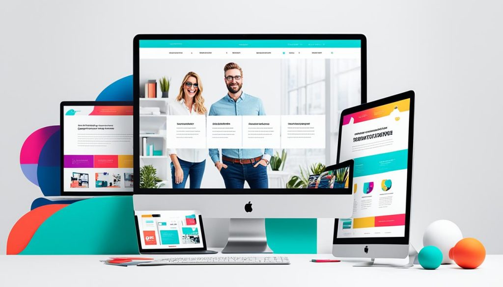
These exceptional examples highlight the importance of pushing the boundaries in marketing agency website designs. By embracing bold colors and fonts, incorporating animations, and creating a captivating and cohesive design, agencies can create an immersive user experience that leaves a lasting impression.
| Agency | Key Features |
|---|---|
| Bikebear | Bold colors and fonts, playful animations, animated bears wearing sunglasses |
| Creative Theory | Captivating and cohesive design, leadership team hover effects |
B2B Software Company Website Designs
When it comes to B2B software companies, a user-friendly website design is essential to effectively engage potential customers and showcase their products. Two prime examples of successful B2B software company websites are Calendly and Asset Class.
Calendly
Calendly, a leading scheduling software company, has implemented a user-friendly design that effortlessly conveys the benefits of their product. The website features a clean and intuitive layout, making it easy for visitors to navigate and understand the scheduling solutions offered. Calendly’s simple and straightforward design ensures that users can quickly grasp the value of their product, leading to increased conversions.
Moreover, Calendly incorporates consistent color schemes throughout their website to maintain brand identity. The harmonious blend of colors creates a visually appealing and cohesive experience for users, enhancing the overall impression of professionalism and reliability.
Furthermore, Calendly effectively utilizes product screenshots throughout their website, showcasing the software’s features and capabilities. These screenshots serve as visual aids that further emphasize the value and ease-of-use of their scheduling solution, making it easier for potential customers to envision themselves using the product.
Asset Class
Asset Class, a software company specializing in solutions for private equity firms, stands out with its impeccable website design. The company website exhibits a consistent and elegant color scheme, instilling a sense of trust and professionalism in visitors.
Similar to Calendly, Asset Class prioritizes a user-friendly design to ensure a seamless browsing experience. The intuitive navigation and clear informational hierarchy guide users effortlessly through the website, allowing them to quickly find the information they need about the company and its products.
To establish credibility and highlight their expertise, Asset Class incorporates product screenshots strategically. These screenshots demonstrate the software’s functionality and benefits, providing potential customers with a glimpse of the value Asset Class can deliver to their businesses.
Overall, Calendly and Asset Class exemplify the importance of user-friendly design, consistent color schemes, and the utilization of product screenshots in B2B software company websites. By prioritizing these elements, software companies can effectively communicate their product’s value, attract potential customers, and drive conversions.
| Website | User-Friendly Design | Consistent Color Scheme | Product Screenshots |
|---|---|---|---|
| Calendly | ✓ | ✓ | ✓ |
| Asset Class | ✓ | ✓ | ✓ |
Nonprofit and Social Impact Agency Website Designs
When it comes to nonprofit and social impact agency website designs, two outstanding examples come to mind: Blavity Inc. and Citizen. These organizations have successfully utilized impactful visuals, logical presentation of information, and powerful campaigns to engage their audiences and amplify their brand messages.
Blavity Inc., a network of brands serving a Black millennial audience, captivates visitors with their use of a full-screen video on their homepage. This immersive and visually stunning element immediately grabs attention and effectively conveys their brand message. Through the use of engaging visuals, Blavity Inc. creates a memorable user experience that resonates with their target audience.
Citizen, on the other hand, impresses with its simple yet logical presentation of information. Their website showcases the power of organization and clarity in delivering their mission and impact. By presenting information in an easily digestible format, Citizen effectively communicates their campaigns and initiatives, making it easy for visitors to understand the value they provide.
These examples highlight the importance of thoughtful information architecture in nonprofit agency website designs. By organizing information logically and ensuring a seamless user journey, nonprofits can effectively convey their message and inspire action.
Let’s take a closer look at these inspiring examples:
Blavity Inc.: Full-Screen Video Impact
Blavity Inc. leverages the power of a full-screen video to create an immersive and visually appealing website experience. The video instantly captures attention and effectively communicates their brand message in a concise and engaging way. By utilizing this powerful element, Blavity Inc. sets themselves apart and leaves a lasting impression on visitors.
Citizen: Powerful Campaigns and Logical Presentation
Citizen’s website stands out through its powerful campaigns and logical presentation of information. The site effectively showcases their impactful work and engages visitors through clear and concise messaging. By presenting information in a logical manner, Citizen provides visitors with a seamless journey, making it easy for them to understand and connect with the organization’s mission.

These examples demonstrate how nonprofit and social impact agency website designs can effectively create powerful connections with their target audiences. By incorporating visually appealing elements like full-screen videos and showcasing thoughtfully crafted campaigns, nonprofits can engage visitors and inspire them to take action.
Unique and Innovative Website Designs
Garden Eight, a digital design studio, offers an innovative website design that captivates users with its interactive canvas. Featuring animal-like shapes and elements, their website provides a visually engaging and immersive experience. Users can explore and interact with the canvas, making it an interactive platform that brings creativity to life.
Another example of innovative design is showcased by Humain, a design agency that specializes in creating visually stunning cursor effects. As users hover over different elements on their website, hidden illustrations are revealed, creating a sense of curiosity and interactivity. This unique approach not only engages users but also leaves a lasting impression.
Similarly, KD Capital leverages cursor effects on their website to deliver an immersive user experience. Their visually captivating design encourages users to explore and interact with the different elements on the page. By implementing innovative cursor effects, KD Capital sets themselves apart and creates a memorable browsing experience for their visitors.
These examples highlight the importance of incorporating innovative design elements into website development. From interactive canvases to creative cursor effects, these techniques enhance user engagement and create memorable experiences. In the age of digital transformation, it is crucial for businesses to embrace innovative website design to stand out in the competitive online landscape.
| Website Design | Key Features |
|---|---|
| Garden Eight | Interactive canvas with animal-like shapes |
| Humain | Visually stunning cursor effects revealing hidden illustrations |
| KD Capital | Immersive cursor effects engaging users |
Showcase of Custom Corporate Website Designs
As a global community of designers, we take pride in presenting a wide range of custom corporate website designs tailored to various industries. Our portfolio includes exceptional designs for law firms, fintech companies, real estate agencies, and business consulting firms.
Each custom corporate website design in our showcase reflects the unique identity and goals of the respective industry. Whether you require a sophisticated and professional look for your law firm, a cutting-edge and user-friendly design for your fintech company, an elegant and visually stunning website for your real estate agency, or a modern and polished site for your business consulting firm, we have you covered.
Our diverse collection of custom corporate website designs demonstrates the creativity and innovation that can be applied to elevate your online presence. Browse through our inspiring examples and draw inspiration for your own website. We understand the importance of crafting a captivating and functional website that not only engages visitors but also effectively communicates your brand message. Let our designs be your guide in creating an impressive online platform for your corporate endeavors.
FAQ
What is company website design?
Why is company website design important?
What is responsive web design?
What are SEO-friendly websites?
How can a modern website design benefit my business?
Are professional web design services affordable?
Why is it important for a website to be mobile-friendly?
- How Strategic SEO Drove Growth for a CPAP E-commerce Brand - July 24, 2025
- Top 3 SEO Companies in Toronto: An Analytical Comparison - July 23, 2025
- SEO for Entry Door Services - April 24, 2025














Post Comment
You must be logged in to post a comment.