9 inspiring examples of ecommerce websites for 2024
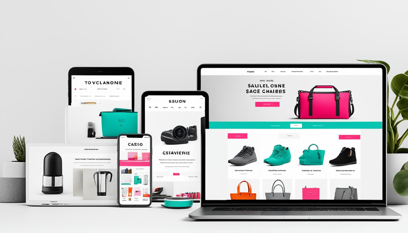
Did you know that by 2024, the global ecommerce market is projected to reach a staggering $6.4 trillion USD? With online shopping becoming increasingly popular and accessible, businesses are striving to create outstanding ecommerce websites that catch the attention of customers and elevate their shopping experience.
In this article, I’ll showcase nine inspiring examples of ecommerce websites that are pushing the boundaries of design and user experience. From personalized weight loss treatments to sustainable home essentials, these websites are leading the way in shaping the future of online shopping in 2024.
Key Takeaways:
- Discover nine innovative and inspiring ecommerce websites that are reshaping the online shopping landscape.
- Gain insights into the latest design trends and user experience enhancements driving the success of these ecommerce platforms.
- Explore how sustainability, brand values, and unique user experiences are being incorporated into ecommerce websites.
- Learn from successful businesses that are leveraging platforms like Squarespace and Shopify to create visually appealing and intuitive online stores.
- Get inspired to enhance your own ecommerce website design and provide an exceptional shopping experience for your customers.
Made With Squarespace
The ecommerce websites made with Squarespace are known for their clean and visually appealing designs. From Jones Bar-B-Q, a restaurant famous for its flavors, to Supernatural, a plant-based kitchen brand, these websites showcase the power of simple yet effective design. One common feature among these websites is the use of the Squarespace ecommerce platform, which allows for the creation of a three-column store layout.
When it comes to creating a successful and visually stunning online store, the platform you choose plays a crucial role. Squarespace offers an intuitive and user-friendly interface that makes it easy for businesses to showcase their products and engage with their customers. The platform provides a range of customizable templates that can be tailored to fit any brand, ensuring a unique and cohesive look for your online store.
One of the standout features of Squarespace is its ability to create a three-column store layout. This layout provides a clear and organized way to showcase your products, allowing customers to easily navigate through different categories and find what they’re looking for. Whether you’re selling clothing, accessories, or home goods, the three-column store layout offers a visually appealing and convenient browsing experience for your customers.
Let’s take a closer look at two ecommerce websites that are made with Squarespace and demonstrate the power of this platform:
Jones Bar-B-Q
Jones Bar-B-Q is a renowned restaurant known for its mouthwatering flavors and traditional barbecue dishes. Their Squarespace-powered online store captures the essence of their brand with a clean and minimalist design. The three-column store layout allows them to showcase their menu items, sauces, and merchandise in an organized and visually appealing manner. Customers can easily browse through their offerings, add items to their cart, and place orders with a seamless checkout process.
Supernatural
Supernatural is a plant-based kitchen brand that offers delicious and nutritious meal options. Their Squarespace website showcases their range of products with stunning product photography and engaging storytelling. The three-column store layout enables them to categorize their products based on dietary preferences, making it easy for customers to find what suits their needs. With Squarespace’s ecommerce platform, Supernatural has created a visually captivating online store that aligns with their brand values and delivers a delightful shopping experience.
| Benefits of Squarespace ecommerce platform |
|---|
| Intuitive and user-friendly interface |
| Customizable templates for a unique look |
| Three-column store layout for clear product browsing |
| Seamless checkout process |
| Visually appealing and organized online store |
Made With Shopify
The ecommerce websites made with Shopify offer a seamless shopping experience for customers. Shopify’s user-friendly interface and robust features make it a popular choice for businesses looking to establish an online presence. One notable example is Allbirds, a renowned shoe company that prioritizes comfort and sustainability.
Allbirds leverages the power of Shopify to optimize its website navigation and showcase its innovative at-home try-on feature. With this feature, customers can order multiple sizes of a shoe, try them on at home, and easily return the ones that don’t fit perfectly. This convenient and hassle-free process eliminates the uncertainty of online shoe shopping and enhances customer satisfaction.
Another great example of a successful Shopify store is Feastables, a chocolate bar brand created by MrBeast. Feastables utilizes user-generated content to build trust and engage with its customers. The brand encourages buyers to leave detailed reviews and share their experiences on social media platforms. By leveraging user-generated content and implementing advanced review systems, Feastables ensures transparency and authenticity, ultimately strengthening its customer relationships.
Examples of ecommerce websites made with Shopify:
- Allbirds – A sustainable shoe company that offers at-home try-on.
- Feastables – A chocolate bar brand created by MrBeast, leveraging user-generated content.
| Features | Allbirds | Feastables |
|---|---|---|
| Navigation Optimization | ✓ | ✓ |
| At-home try-on | ✓ | |
| User-generated content | ✓ | |
| Advanced review systems | ✓ |
Creative and Playful Designs
Melula, a Danish children’s fashion line, stands out with its minimalistic and playful website design. When you visit Melula’s website, you’ll immediately notice the vibrant colors and delightful imagery that capture the essence of fun and imagination. The homepage is carefully crafted with a minimalistic approach, creating a clean and visually engaging user experience.
The use of whitespace in the design allows the products and visuals to take center stage, making it easy for visitors to focus on the child-like wonder that Melula aims to inspire. The simplicity of the layout enhances the overall appeal and ensures an intuitive browsing experience.
If you head over to the Shop page, you’ll find a perfect continuation of the minimalistic design aesthetic. The product listings are clean and straightforward, allowing the beautiful clothing pieces to shine. Melula’s emphasis on minimalism not only highlights the individual products but also creates a sense of calmness and clarity for customers.
| Benefits of Melula’s minimalistic design: | Why it works: |
|---|---|
| Enhanced user experience | The clean and intuitive layout allows for easy navigation. |
| Focus on products | The minimalistic design puts the spotlight on the clothing pieces, enticing customers to explore. |
| Captivating visuals | The playful colors and imagery create an emotional connection with visitors, fostering a sense of joy and excitement. |
Sustainability and Brand Values
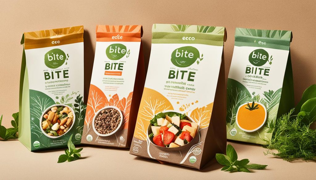
I am excited to highlight Bite, a cosmetics store that exemplifies a strong commitment to sustainability and eco-friendly practices. With a clean and modern design, Bite’s website perfectly showcases its brand values through minimalistic visuals and a clear focus on sustainability. The use of pastel colors and high-quality product images further reinforces the brand’s dedication to eco-consciousness.
One of the remarkable aspects of Bite is its commitment to eco-friendly packaging. The brand uses innovative and sustainable materials to ensure that its products are not only good for the skin but also for the environment. By prioritizing eco-friendly packaging, Bite reduces its carbon footprint and contributes to the preservation of our planet.
In addition to sustainable packaging, Bite prioritizes sustainability in its product offerings as well. The brand is known for its range of clean and cruelty-free cosmetics, using natural and ethically sourced ingredients. This aligns with the growing demand for eco-conscious and ethical beauty products among consumers.
By choosing Bite, customers can feel confident that they are making a positive impact on the environment without compromising on quality or style. It’s refreshing to see a brand like Bite paving the way for sustainability in the cosmetics industry.
With its commitment to sustainability and eco-friendly practices, Bite sets an inspiring example for other brands to follow. Through its clean and modern website design, the brand effectively communicates its values and resonates with environmentally conscious consumers. Bite proves that beauty and sustainability can go hand in hand.
Take a moment to explore Bite’s website and discover their wide range of eco-friendly cosmetics that will not only enhance your beauty but also contribute to a greener future.
Bite’s Commitment to Sustainability
| Key Features | Sustainability Benefits |
|---|---|
| Eco-friendly packaging | Reduces carbon footprint and promotes waste reduction |
| Clean and cruelty-free cosmetics | Supports ethical beauty practices and uses natural ingredients |
| Minimalistic website design | Efficient use of resources and promotes simplicity |
| Pastel colors and high-quality images | Enhances visual appeal while maintaining brand values |
Shop consciously and join Bite in their mission to create a more sustainable future for the beauty industry.
Unique User Experience
When it comes to delivering a truly exceptional user experience, Potion, a software company, takes it to the next level on its ecommerce website. With a focus on interactivity and engagement, Potion leverages interactive elements that include moving objects and draggable items, resulting in a playful and immersive design.
By incorporating these interactive elements, Potion invites visitors to actively engage with the website while exploring products or services. The ability to interact with movable objects not only adds a sense of fun but also enhances the overall user experience, making it more memorable and enjoyable.
In addition to interactive elements, Potion employs animated GIFs strategically throughout the website. These animated visual elements serve as attention-grabbing elements, capturing visitors’ interest and drawing them further into the site. With carefully chosen animations, Potion elevates the visual appeal and ensures that users stay engaged and captivated by the website’s content.
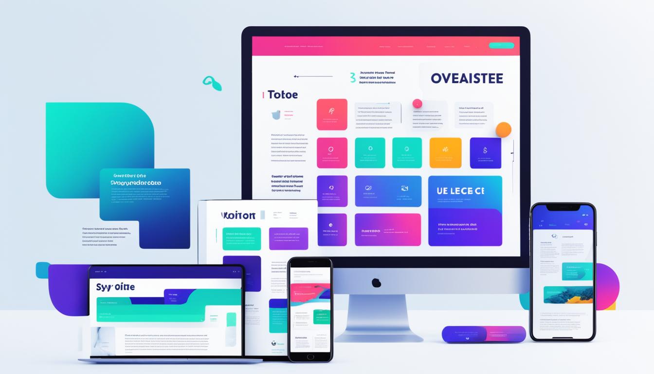
This image showcases the immersive and interactive elements available on Potion’s ecommerce website, creating a dynamic user experience that sets it apart from traditional websites. These features combine to create a website that stands out and successfully grabs the attention of users, resulting in increased time spent on the site and ultimately higher conversion rates.
Through the strategic use of Potion’s interactive elements and animated GIFs, visitors are treated to a unique and engaging journey that keeps them coming back for more. Whether it’s exploring products, navigating through different sections, or simply enjoying the interactive experience, Potion’s ecommerce website fosters a connection with users and leaves a lasting impression.
Interactive Elements and Movable Objects in Action:
| Interactive Element | Description |
|---|---|
| Moving Objects | Objects on the website can be visually moved by the user, enhancing the interactive experience. |
| Draggable Items | Users have the ability to drag and drop items on the website, making the experience more personalized and interactive. |
Luxury and Sophistication
When it comes to luxury timepieces, Longines is a name that exudes sophistication and elegance. Their website showcases the brand’s commitment to quality and precision through its aviation-inspired design and captivating background videos on the homepage.
The attention to detail is evident in the use of serif fonts, which add a touch of class and refinement to the overall aesthetic. As visitors scroll through the website, they are treated to scroll-triggered animations that enhance the user experience and create a sense of immersion.
Longines’ aviation-inspired design pays homage to the brand’s rich heritage and association with the world of aviation. The background videos further elevate the website’s appeal, offering a glimpse into the brand’s craftsmanship and the intricate mechanisms that go into creating their luxurious timepieces.
Whether you are a watch enthusiast or simply appreciate impeccable design, Longines’ website is sure to captivate with its blend of elegance, sophistication, and attention to detail.
FAQ
What are some inspiring examples of ecommerce websites for 2024?
What ecommerce platform is popular among websites showcased in this article?
Are there any unique features or layouts used by the Squarespace websites?
How does Allbirds optimize the shopping experience on its website?
How does Feastables enhance customer trust on its Shopify website?
What makes Melula’s website design stand out?
How does Bite showcase its brand values on its ecommerce website?
How does Potion offer a unique user experience on its ecommerce website?
What design elements contribute to Longines’ website exuding luxury and sophistication?
- How Strategic SEO Drove Growth for a CPAP E-commerce Brand - July 24, 2025
- Top 3 SEO Companies in Toronto: An Analytical Comparison - July 23, 2025
- SEO for Entry Door Services - April 24, 2025







Post Comment
You must be logged in to post a comment.