11 Powerful Examples of Responsive Web Design
Did you know that over 60% of website visits now happen on mobile devices? With the rise of smartphones and tablets, it has become essential for businesses to prioritize responsive web design. Responsive design goes beyond simple mobile-friendly approaches, dynamically adjusting website layouts based on device parameters. It ensures a seamless experience for visitors, regardless of the device they use.
In this article, I will showcase 11 powerful examples of responsive web design that will inspire you in creating your own website. From flexible grid layouts to tailored user experiences, these websites demonstrate the effectiveness of responsive design in delivering exceptional user experiences on all devices.
Key Takeaways:
- Over 60% of website visits occur on mobile devices, highlighting the significance of responsive design.
- Responsive design dynamically adjusts website layouts based on device parameters to provide a seamless user experience.
- The showcased websites exemplify the use of flexible grid layouts, tailored user experiences, and minimalist design to enhance responsiveness.
- Building a responsive website is crucial for attracting and retaining visitors on all devices.
- By implementing responsive design principles, businesses can improve user satisfaction and drive higher engagement.
Dribbble – Demonstrating the Flexible Grid Principle
Dribbble is an excellent example of responsive web design, showcasing the effective use of a flexible grid layout. This design approach allows the website to adapt seamlessly to different screen sizes and devices, providing an optimal viewing experience for users.
One of the standout features of Dribbble’s responsive design is the use of a flexible grid layout for the portfolio tiles. On larger screens, the tiles are displayed in a 4×3 grid, allowing for the visibility of multiple portfolio items at once. This layout strikes a perfect balance between showcasing the work and maintaining a visually appealing design.
As the screen size decreases, the grid adjusts to a single column layout to ensure maximum visibility and accommodate the scrolling behaviors commonly found on mobile devices. This responsive approach optimizes the user experience, making it easy for visitors to navigate the portfolio and explore the showcased projects.
With Dribbble’s flexible grid layout, users can enjoy a consistent and engaging browsing experience across a wide range of devices. Whether they are accessing the website on a desktop, tablet, or mobile phone, the responsive design ensures that the content is beautifully displayed and accessible to all.
| Benefits of Dribbble’s Flexible Grid Layout | Responsive Website Examples |
|---|---|
| Adapts to different screen sizes | Other responsive websites can learn from Dribbble’s flexible grid layout approach |
| Showcases multiple portfolio items on larger screens | Flexible grid layout provides an engaging user experience |
| Optimizes visibility and scrolling behaviors on mobile devices | Dribbble’s responsive design ensures content accessibility across devices |
SWISS Air – Simple and Uncluttered User Experience
When it comes to responsive web design, SWISS Air is a prime example of creating a seamless and uncluttered user experience on mobile devices. By utilizing responsive web development techniques, SWISS Air ensures that their website is mobile-friendly and optimized for easy navigation.
The desktop version of the SWISS Air website showcases secondary features and branded imagery, providing users with a visually appealing experience. However, when it comes to mobile devices, SWISS Air takes a different approach. They focus solely on the core action of booking a flight, removing any unnecessary clutter and distractions.

This uncluttered design allows users to quickly and efficiently find and book their desired flights without any unnecessary distractions. By prioritizing the flight search functionality, SWISS Air ensures that users can accomplish their goals with ease, providing a seamless mobile experience.
Benefits of the Simple and Uncluttered User Experience:
- Easy and intuitive navigation on mobile devices
- Quick access to flight search functionality
- Reduced distractions, allowing users to focus on their primary goal
- Enhanced user satisfaction and increased conversion rates
SWISS Air’s implementation of responsive design principles demonstrates the importance of creating a mobile-friendly and uncluttered user experience. By removing unnecessary clutter and focusing on core functionalities, SWISS Air provides a seamless and efficient experience for users on the go.
| Responsive Design | Responsive Website Examples | Mobile-Friendly Design | Uncluttered User Experience |
|---|---|---|---|
| SWISS Air | Dropbox | Etsy | Kern |
Dropbox – Tailoring the User Experience Across Devices
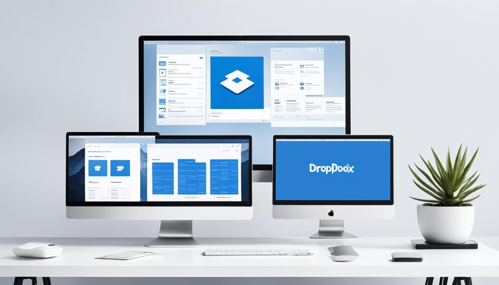
When it comes to responsive design, Dropbox takes customization to the next level by tailoring the user experience to different devices. By recognizing the unique characteristics of smartphones, tablets, and desktop screens, Dropbox ensures that users have an optimized experience no matter where they access their files.
One of the key strategies employed by Dropbox is the creation of different versions of their website for each device. This approach allows them to focus on specific user intents and design elements that are most effective for each screen size.
For smartphones, Dropbox streamlines the interface to prioritize quick access to files and actions. The mobile version features a simplified navigation menu, prominent call-to-action buttons, and intuitive gestures for easy file browsing and management.
On tablets, Dropbox capitalizes on the larger screen real estate to provide a more expansive and immersive experience. With more room to display files and folders, users can explore their content in a way that feels natural and intuitive. The tablet layout also leverages touch interactions, enabling users to navigate through their files with ease.
When it comes to desktop screens, Dropbox acknowledges the increased capabilities and demands of users. The desktop version of their website offers a comprehensive set of features designed for power users and professionals. It includes advanced organization options, collaborative tools, and robust file management capabilities.
By tailoring the user experience across devices, Dropbox ensures that each layout is optimized for the specific needs and intentions of users. Whether accessing files on a smartphone, tablet, or desktop, users can expect a personalized and streamlined experience that supports their workflow and enhances their productivity.
| Device | User Intent | Design Elements |
|---|---|---|
| Smartphones | Quick access to files and actions |
|
| Tablets | Exploration of content |
|
| Desktop | Advanced features and organization |
|
Etsy – Prioritizing Personalization and Quick Navigation
Etsy, an online marketplace, showcases an exemplary implementation of responsive design with its focus on personalization and quick navigation. With a flexible grid approach, Etsy ensures its website adapts seamlessly across different devices, providing an optimized browsing experience for users.
The desktop and tablet versions of Etsy’s website feature a similar layout, offering a consistent and familiar experience for users transitioning between these devices. This design choice enables users to navigate the website with ease, irrespective of the device they are using.
However, Etsy takes a step further when it comes to mobile devices. Understanding the specific browsing behaviors of mobile users, Etsy’s mobile version prioritizes personalization and quick navigation to enhance the user experience.
In the mobile version, Etsy prominently places a search bar at the top of the page, allowing users to quickly find the products they desire. This feature caters to the fast-paced nature of mobile browsing, streamlining the search process and ensuring users can easily discover their desired items.
Moreover, Etsy simplifies its navigation menu for mobile users. By condensing the menu options into a single, easily accessible button, users can effortlessly access various sections of the website without cluttering the screen. This approach prioritizes quick navigation, enabling users to browse through categories, search results, and seller profiles efficiently.
Through its responsive design strategy, Etsy effectively combines the flexibility of a grid approach with the importance of personalization and quick navigation, delivering an exceptional user experience across devices.
Wired – Fluid Grids and Column Layouts
When it comes to responsive design, Wired magazine sets a stellar example with its innovative use of fluid grids and column layouts. By leveraging these techniques, Wired ensures that its website adapts seamlessly to different screen sizes and resolutions, delivering an exceptional user experience on any device.
For desktop and tablet screens, Wired maintains a consistent column layout, allowing readers to navigate through articles and multimedia content with ease. This grid-based approach provides a familiar and intuitive reading experience, reminiscent of flipping through the pages of a traditional magazine.
As the screen size decreases to mobile devices, Wired gracefully transitions to a single column layout, optimizing the viewing experience for smaller screens. This responsive design allows for effortless scrolling and ensures that readers can consume content without the need for horizontal scrolling or zooming. The fluid grids smoothly adjust the placement of content, maintaining readability and visual integrity.
But responsive design doesn’t stop at content presentation. Wired also recognizes the importance of responsive ads in maintaining a balanced and engaging user experience. By optimizing the display of ads to suit different devices, they ensure that ads are rendered seamlessly among the articles, enhancing readability and keeping users engaged.
Take a look at the following examples to see how Wired’s fluid grids and column layouts shape their website across different devices:
- Desktop and Tablet Layout (with consistent column layout for intuitive reading experience)
- Mobile Layout (with fluid grids and single column layout for optimized viewing)
Wired’s responsive design approach not only highlights the importance of fluid grids and column layouts but also showcases the impact of media render and responsive ads. By embracing these techniques, Wired ensures that readers can enjoy their content seamlessly, no matter what device they are using.
Kern – Smooth Slider and Minimalist Design
When it comes to responsive website design, Kern, a design agency based in Canada, stands out for its seamless adaptability across different devices. Their website showcases their exceptional work using a smooth slider that elegantly highlights captivating images and engaging text.
With a focus on delivering a unified user experience, Kern maintains a minimalist design aesthetic that remains consistent across all devices. This minimalist approach ensures that visitors can easily navigate the website and fully appreciate the agency’s portfolio without distraction.
One of the standout features of Kern’s responsive design is the smooth slider. This interactive element smoothly transitions between different project showcases, allowing users to effortlessly explore the agency’s work and engage with their captivating visuals. Whether on a desktop, tablet, or mobile device, the smooth slider remains dynamic and intuitive, enhancing the overall user experience.
The minimalist design, combined with the smooth slider, demonstrates Kern’s commitment to presenting their design services in the most visually appealing and user-friendly manner. By leveraging the power of responsive web design, Kern effectively engages their audience and showcases their expertise in delivering sleek and impactful digital experiences.
FAQ
What is responsive web design?
Why is responsive web design important?
What are some examples of responsive web design?
How does Dribbble demonstrate the flexible grid principle?
How does SWISS Air ensure a simple and uncluttered user experience on mobile devices?
How does Dropbox tailor the user experience across devices?
How does Etsy prioritize personalization and quick navigation in their responsive design?
How does Wired utilize fluid grids and column layouts in their responsive design?
How does Kern incorporate a smooth slider and minimalist design in their responsive website?
- How Strategic SEO Drove Growth for a CPAP E-commerce Brand - July 24, 2025
- Top 3 SEO Companies in Toronto: An Analytical Comparison - July 23, 2025
- SEO for Entry Door Services - April 24, 2025






Post Comment
You must be logged in to post a comment.