12 WordPress Web Design Trends That Will Inspire You
Did you know that 37% of all websites on the internet are powered by WordPress?
When it comes to web design, staying up-to-date with the latest trends is essential to creating a visually appealing and engaging website. And with over a third of all websites being built on WordPress, it’s crucial for WordPress designers and developers to incorporate the latest design trends into their projects. From bold typography to micro-interactions, these design trends play a key role in shaping the aesthetics and functionality of modern websites.
Key Takeaways:
- WordPress powers 37% of all websites on the internet.
- Staying updated with design trends is crucial for creating visually appealing websites.
- Incorporating design trends into WordPress projects enhances aesthetics and functionality.
Bold Typography
Bold typography is a timeless web design trend that uses large and bold fonts to grab attention and create a visual hierarchy on a website. By using bold typography, you can make headlines, taglines, and important messages stand out, effectively conveying your brand’s message to your audience. This trend adds a sense of personality and uniqueness to your website, making it visually appealing and memorable.
https://www.youtube.com/watch?v=oiovlhEGZNM
When implemented correctly, bold typography can enhance the overall aesthetics of your website and create a strong visual impact. It helps establish a clear hierarchy of information, guiding users through the content and directing their attention to key elements. By combining bold typography with contrasting colors and creative layouts, you can create a visually stunning website that captures the attention of your visitors.
Your choice of typography should align with your brand’s identity and purpose. Whether you opt for a clean and modern sans-serif font or a stylish and sophisticated serif font, the key is to choose a typeface that reflects your brand’s personality and resonates with your target audience.
When using bold typography, it’s important to maintain readability. Ensure that the font size, line height, and letter spacing are optimized for easy legibility. In addition, consider the responsive design aspect of your website to ensure that the typography scales appropriately across different devices.
By incorporating bold typography into your web design, you can create a visually appealing and impactful website that effectively communicates your message and helps your brand stand out in the competitive digital landscape.
Micro-Interactions
When it comes to web design trends, micro-interactions are a game-changer. These small animations or interactions on a website respond to user actions like hovering, scrolling, or clicking, creating a seamless and interactive experience.
Micro-interactions serve multiple purposes. They provide feedback to users, indicating that an action has been acknowledged or completed. They also guide users, highlighting clickable elements and encouraging engagement. Whether it’s a subtle hover effect on a button or an animated icon to indicate progress, micro-interactions add depth and interactivity to your website.
By incorporating micro-interactions into your web design, you can enhance user engagement and provide an enjoyable interactive experience. Users appreciate the small details that make a website feel alive and responsive to their actions. These interactive elements keep them engaged and encourage them to explore further.
Enhancing User Engagement
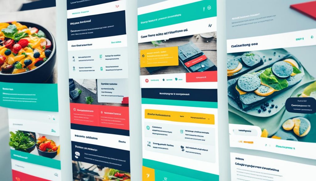
Micro-interactions play a crucial role in improving user engagement. They capture attention, guide navigation, and provide visual cues that keep users immersed in your website. By leveraging micro-interactions, you can create a website that users want to explore, improving the overall user experience.
For example, imagine a website with a scrolling animation that triggers as users scroll down the page. This subtle motion captures attention, making the scrolling experience smoother and more enjoyable. It adds a layer of interactivity to the website, enticing users to interact further with the content.
Additionally, micro-interactions can be used to gamify certain elements of your website. For instance, a simple hover effect that reveals hidden information or an animated icon that rewards users’ interactions can create a sense of joy and accomplishment. These small interactions enhance the overall user experience, leaving a lasting impression on your visitors.
Improving the Interactive Experience
Interactive experiences are key to keeping users engaged and exploring your website. With micro-interactions, you can inject interactivity into various elements, ensuring that users have a dynamic and engaging experience.
Micro-interactions can be used to animate icons, reveal additional content, or provide visual feedback when users interact with specific elements on your website. For instance, a button that changes color or shape when clicked gives users immediate feedback, reinforcing their action. This enhances the interactive experience, making users feel more connected to your website.
Moreover, micro-interactions can contribute to the overall aesthetic appeal of your website. From subtle fades and transitions to more complex animations, these interactions add a layer of visual interest and create an immersive experience for users. By carefully crafting micro-interactions, you can create a web design that stands out and leaves a lasting impression.
Dark Mode
Dark mode is a popular web design trend that has gained significant traction in recent years. With its sleek and modern look, dark mode provides a refreshing alternative to traditional light-themed websites. By using a dark color palette, dark mode creates a visually appealing design that stands out and captivates users.
One of the key benefits of dark mode is its ability to reduce eye strain. The darker background and muted colors minimize the contrast between the screen and the surrounding environment, resulting in a more comfortable and immersive browsing experience. This is especially beneficial for users who spend extended periods of time on websites or are sensitive to bright lights.
Moreover, dark mode allows specific elements on your website to shine. By employing strategic color choices and contrast, you can highlight important features, call-to-action buttons, or specific content sections. This not only enhances the visual appeal but also improves the overall user experience by directing users’ attention to key elements.
Incorporating dark mode into your web design not only aligns with the latest trends but also offers a range of practical benefits. By creating a design that is easy on the eyes and visually striking, you can enhance user engagement, encourage longer browsing sessions, and leave a lasting impression.
To illustrate the impact of dark mode, let’s take a look at a comparison of two versions of a website: one with a light theme and another with dark mode enabled.
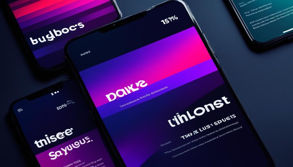
Dark Mode vs. Light Theme: A Visual Comparison
| Element | Light Theme | Dark Mode |
|---|---|---|
| Background | White | Dark gray or black |
| Foreground Text | Black | White or light gray |
| Visual Hierarchy | Achieved through color contrast | Enhanced with vibrant accents |
| Highlights | Subtle or muted shades | Contrasting and eye-catching colors |
| Overall Feel | Clean and minimalistic | Sleek and modern |
As you can see from the comparison, dark mode offers a distinct visual appeal and a more focused viewing experience. It creates a sense of depth and sophistication, while also reducing eye strain, making it an attractive choice for web designers and users alike.
Website Storytelling
Website storytelling is an innovative web design trend that is revolutionizing the way brands interact with their audience. It goes beyond just presenting information and focuses on creating an immersive experience through visuals, text, animations, and micro-interactions. As a web designer, integrating storytelling into your website design can effectively convey your brand’s messaging and captivate your visitors.
By leveraging website storytelling, you can guide your audience through a carefully crafted narrative that evokes emotions and establishes a connection with your brand. Through the clever use of large text, high-quality images, mesmerizing animations, and engaging micro-interactions, you can create a visually stunning and interactive website experience that leaves a lasting impression.
One of the key advantages of website storytelling is its ability to communicate complex information in a compelling manner. Instead of bombarding visitors with overwhelming text, you can break down your message into digestible chunks and present it in a visually appealing way. This not only enhances the user experience but also improves understanding and retention of your brand’s value proposition.
Moreover, website storytelling allows you to leverage visual effects to enhance the overall impact of your website design. From subtle parallax scrolling to mesmerizing background videos, you can use these visual effects strategically to captivate your audience and create a memorable experience. By immersing visitors in a captivating story, you can foster a sense of connection and loyalty towards your brand.
FAQ
What are the top WordPress web design trends?
What is bold typography in web design?
What are micro-interactions in web design?
What is dark mode in web design?
What is website storytelling in web design?
- How Strategic SEO Drove Growth for a CPAP E-commerce Brand - July 24, 2025
- Top 3 SEO Companies in Toronto: An Analytical Comparison - July 23, 2025
- SEO for Entry Door Services - April 24, 2025






Post Comment
You must be logged in to post a comment.