Top 12 Informational Website Examples To Follow Now
Did you know that 75% of users judge a company’s credibility based on their website design? It’s true! A well-designed and informative website is crucial for creating a positive impression and providing valuable content to visitors. Whether you’re looking for website inspiration, want to create a top websites list, or need recommendations for the best informational sites, you’ve come to the right place.
In this article, I will showcase 12 exceptional informational website examples that you can follow to enhance your own website. These leading informational sites incorporate the latest website trends, prioritize user experience, and provide valuable content for their audiences. From sleek designs to easy-to-navigate architectures, these websites set the standard for excellence in web design.
If you’re ready to be inspired and take your website to the next level, let’s dive in and explore these top 12 informational website examples!
Key Takeaways:
- Informative websites play a crucial role in establishing credibility and providing valuable content.
- A well-designed website can enhance the user experience and act as a powerful sales tool.
- These top 12 informational website examples showcase the latest trends in web design.
FreshBooks Informational Website Design
When it comes to website design, FreshBooks has hit the mark with their outstanding informational website. From its visually appealing layout to its user-friendly interface, FreshBooks’ website is a shining example of how to create an easy-to-consume and engaging online platform.
One of the standout features of the FreshBooks website is its storytelling approach. As users scroll down the page, they are presented with a narrative-like flow of information that keeps them engaged and encourages them to continue exploring. This design tactic not only makes the website more captivating but also ensures that visitors can easily consume the content.
The FreshBooks website is designed with usability in mind. It incorporates distinctive calls-to-action (CTAs) throughout the site, guiding users to take specific actions, such as signing up for a free trial or contacting customer support. These CTAs are strategically placed and designed to stand out, ensuring that users can easily navigate the website and find the information they need.
To further enhance the credibility of their product, FreshBooks includes testimonials on their homepage from satisfied customers. These testimonials serve as social proof and build trust in the company and its services.
Not only is the FreshBooks website visually appealing and user-friendly, but it is also optimized for mobile devices. With a responsive design, the website provides a seamless experience for users accessing it from various devices, further enhancing its usability.
Key Features of FreshBooks Informational Website Design:
- Visually appealing layout
- User-friendly interface
- Storytelling approach
- Distinctive calls-to-action (CTAs)
- Credibility-building testimonials
- Mobile-optimized design
| Pros | Cons |
|---|---|
| Engaging storytelling approach | No table data available |
| Distinctive CTAs guide users | No table data available |
| Mobile-optimized design | No table data available |
| Credibility-building testimonials | No table data available |
Book Landing: Information Website Template (free)
Looking for an information website template that combines a minimalistic design with a conducive color scheme? Look no further than the Book Landing template. This free template offers an excellent example of an informative website that is both visually appealing and user-friendly.
One of the standout features of the Book Landing template is its focus on book information. It allows users to access and read content from the book directly on the website. Whether you’re showcasing excerpts, chapters, or even the entire book, this template provides a seamless reading experience for your audience.
The design of the Book Landing template is sleek and minimalistic, ensuring that the spotlight remains on the book content. The clean layout and typography enhance readability and make it easy for users to navigate through the website. The design choices prioritize simplicity and ease of use, creating a streamlined experience for visitors.
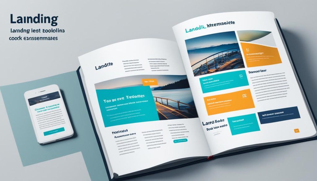
Furthermore, the color scheme chosen for this template contributes to a pleasant reading experience. The colors are carefully selected to complement the book content and create a visually inviting environment for readers. This attention to detail in the color scheme helps to engage users and keep them invested in the book.
Whether you’re an author, a publisher, or someone looking to create an informative website around books, the Book Landing template provides a fantastic starting point. Its minimalistic design, user-friendly features, and conducive color scheme make it an ideal choice for anyone aiming to create an appealing and informative online presence in the realm of books.
| About the Book Landing template | |
|---|---|
| Design | Minimalistic |
| Focus | Book information |
| Features | Read book content on the website |
| Color Scheme | Conducive to reading |
| Benefits | Sleek, user-friendly design |
| Use cases | Authors, publishers, book-related websites |
Airbnb Website Examples
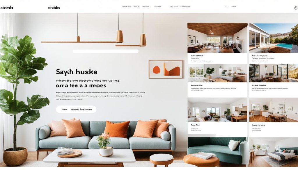
When it comes to informative website design, Airbnb sets a prime example. With its smart search form prominently displayed, finding accommodations is quick and effortless. The primary call-to-action (CTA) for searching is strategically positioned, encouraging users to take action. Additionally, the website features a section showcasing hot offers for hosts, providing an extra incentive for users to explore their options.
The visually appealing and user-friendly design of the Airbnb website enhances the overall user experience. To get started, visitors are greeted with date and destination input fields, making it easy to kickstart their accommodation search. The intuitive layout and streamlined design allow for efficient navigation, ensuring that users find what they need with ease.
Overall, Airbnb’s website exemplifies the importance of a well-designed interface that focuses on user convenience and engagement. By incorporating key elements such as a smart search form, primary CTA, and hot offers, Airbnb creates a seamless user experience that keeps visitors coming back for more.
Next, we’ll explore another informative website that stands out for its unique features and customized sections.
William McDonough Informative Websites Examples
William McDonough’s website showcases a range of innovative features and design elements that make it a standout example of an informative website. With its customized sections and unique features, the website provides an engaging and interactive user experience.
The homepage of the William McDonough website is designed with a well-organized grid layout, allowing visitors to easily navigate and explore different sections of the website. Each grid block represents a distinct topic or aspect of William McDonough’s work, making it easy for users to find the information they are looking for.
One of the standout features of the website is the tag cloud, which adds a visually appealing element to the homepage. The tag cloud showcases relevant keywords and topics related to William McDonough’s work, providing a unique way for users to explore the content on the website.
Additionally, the website includes a complex hero slider functionality that showcases stunning visuals and highlights key projects or initiatives. This interactive element grabs the attention of visitors and encourages them to delve deeper into the website.
Overall, the William McDonough website is a prime example of how customized sections, a unique tag cloud, and well-organized grid blocks can create an informative and visually appealing website. It effectively presents William McDonough’s work and provides visitors with a user-friendly experience.
| Key Features | Benefits |
|---|---|
| Customized sections | Allows for easy navigation and organization of content |
| Unique tag cloud | Enhances visual interest and provides an alternative way to explore the website |
| Well-organized grid blocks | Makes it easy to find and access different sections of the website |
Mint – Informational Website Design Examples
In the realm of informative website design, Mint stands out with its ultra-simple yet visually appealing design. As a financial firm, Mint understands the importance of creating a sense of security and relaxation for its users. The minimalist approach employed in the website’s design reflects these sentiments, offering users a seamless browsing experience.
At first glance, the homepage captures attention with a strong headline that conveys Mint’s commitment to financial management. The concise call-to-action (CTA) prompts visitors to take action and sign up for the service, effectively leading them into the website’s offerings.
The overall layout and navigation of the website are user-friendly and intuitive. Users can easily access the information they need, whether it’s about budgeting, financial planning, or investment strategies. The ultra-simple design, with its clean lines and organized content, streamlines the user experience and fosters a positive interaction with the site.
Mint’s informational website design serves as an excellent example for other businesses in the financial industry. By focusing on a strong headline, concise CTA, and an ultra-simple design, Mint effectively communicates its core message and encourages users to take action.
| Key Features of Mint’s Informational Website Design |
|---|
| Ultra-simple design |
| Strong headline |
| Concise call-to-action |
| User-friendly and intuitive navigation |
Writer Website: Information Website Template (free)
If you are a writer looking to showcase your work and connect with your audience, the Writer Website template is the perfect solution. This informational website template offers a minimalist design that prioritizes a pleasant reading experience.
With this free template, you can easily create a website that highlights your writing and provides visitors with valuable information about you as a writer. The template allows you to showcase snippets of your work, giving readers a taste of your writing style and content.
Designed with simplicity in mind, the Writer Website template ensures that your words take center stage. The clean and uncluttered design allows readers to focus on your writing without any distractions. This minimalist approach creates a calming and immersive experience, enhancing the overall impact of your work.
Whether you are a novelist, non-fiction writer, or blogger, this informational website template can be tailored to suit your specific needs. Use it to build your online presence, attract a wider audience, and establish yourself as an authority in your field. Start sharing your passion for writing with the world today!
FAQ
What are informational websites?
What should informational websites prioritize?
How can a great informational website benefit a company?
What makes the FreshBooks website an effective informational website?
What is special about the Book Landing template as an informational website?
What is noteworthy about the Airbnb website as an informational website?
What makes the William McDonough website stand out as an informational website?
How does the Mint website excel as an informational website?
What is notable about the Writer Website template as an informational website?
- How Strategic SEO Drove Growth for a CPAP E-commerce Brand - July 24, 2025
- Top 3 SEO Companies in Toronto: An Analytical Comparison - July 23, 2025
- SEO for Entry Door Services - April 24, 2025



Post Comment
You must be logged in to post a comment.